You’re looking for eggs.
You come across a highly polished, professionally type-set and printed sign in the window of a mini market, advertising fresh farm eggs. Turn the corner and you’re in a country lane. You see the same message, but this time it’s hand-written on a wooden panel, in front of a barn. Which do you choose?
You’re interested in paragliding.
You come across a professionally type-set and printed sign in the window of a mini market, advertising paragliding flights, detailing the experience of the pilot. Further down the same road you see the same message, hand-written on a wooden panel, in front of a barn. Which do you choose?
BRANDING IS EVERYTHING.
It creates the first impression that instantly communicates the personality of your business. Its appropriateness (or lack thereof ) has the power to build (or destroy) trust in the product or service you offer.
While your brand personality is most likely to remain consistent, you will want to evolve your logo over time to ensure it remains contemporary

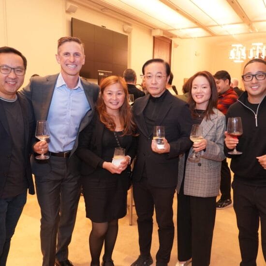
Chris Beer, Founder and CEO of George &
Matilda Eyecare.
If you’re part of a group – like ProVision, George & Matilda Eyecare, Eyecare Plus or EyeQ/NOC – your shared brand will associate you with the other members of the group, assuring you of recognition and creating an expectation – good or bad – that the expertise, product, and service delivery you offer will be consistent with others in the group.
WHAT’S IN A BRAND?
While it’s easy (and fun) to become consumed with developing your logo, it’s important to keep in mind that this is just part of your branding effort – a tangible graphic element that represents your brand. The less tangible aspects that build your brand in its entirety are the way you and your team greet people and communicate information (your brand voice); the way your practice and team is presented; the stock you choose to sell; any areas of clinical expertise you wish to pursue, and even the equipment you invest in.
So, before you hop on to Canva or engage a graphic artist to create your brand, there’s plenty to consider. Much like developing your business plan, you’ll need to map out:
- Your target audience – the demographic and socio-economic features of the people in your area that you’re trying to attract,
- Your mission statement – what you want your practice to be known for,
- Your point of differentiation – what will make your practice stand out from the competition,
- The type of experience you wish to create – do you want your practice to be renowned for sophisticated clinical care/ high-end retail eyewear/affordable frames/kid-friendly consults etc.,
- The geography of the local area – are there elements that should influence the look and feel of the practice you will operate,
- Your long-term plans – if you intend to expand to different locations, will your brand translate?
- The longevity of your practice name – if your personal name is attached to your practice, what happens when you decide to sell?
THE LOGO AT THE CENTRE OF YOUR BRAND

Bailey Nelson store branding.
With all of this in mind, you can now begin to consider the graphic elements that will make up your logo – using colours and forms that will reflect your brand personality, appeal to your target audience, and ensure they feel comfortable and confident in the service you provide.
Much like the hub of a wheel, your logo should be at the centre of your practice’s brand. It should be strong to capture attention, and consistently presented to ensure it is recognised and remembered.
BRAND IMPLEMENTATION
Now, with your brand decided upon and your logo designed, it’s time to consider implementation. This is a team effort, so it pays to ensure everyone is onboard with the branding rationale and in no doubt as to the behaviour expected of them, whenever they are representing your practice.
From your shop window, the signage in practice and the uniforms your staff wear, to your letterhead, advertising and social media, your logo must have prominence. It should be used on your email signature, on your recalls and your receipts. It should also be used on the eyewear accessories you offer to your patients with a sale – the frame case, the eyewear cloth and the lens cleaner. This will ensure that once your patient leaves your premises, you won’t be forgotten. In fact, every time they take their eyewear out of the case or clean their lenses, they and even the people around them, will be reminded of your practice.
CAN YOU CHANGE YOUR LOGO?
 While your brand personality is most likely to remain consistent, you will want to evolve your logo over time to ensure it remains contemporary.
The safest way to do this is with subtle changes to the colours and form, while maintaining the core elements that make your practice instantly identifiable.
This is because, unless you can support a dramatic branding change with a strong promotional budget, you’ll be at risk of losing recognition.
However, that’s not to say it can’t – or shouldn’t be done. In October 2021, ProVision successfully rebranded in an effort to clearly communicate its proposition to optometrists young and old, who are looking to buy into (or sell out of) an independent practice.
The new logo, accompanied by the tag line: ‘Look Forward’, was launched along with three new products – LaunchPro, RecruitPro and SuccessionPro – which aim to support optometrists through the specific stages they travel while on their ownership journey – from entering the profession through to acquiring, launching, growing and, finally, exiting a practice.
Practices that join George & Matilda Eyecare retain their own practice name, as well as adopting the entity’s name. This delivers the best of both worlds – the practice retains the brand recognition and loyalty they’ve earned in the local area, while gaining the additional credibility of George & Matilda’s branding, which is gaining increasing awareness via the organisation’s growing national physical and promotional presence.
Bailey Nelson – which was an entirely corporate model until it recently launched a joint venture partnership option – has dared to create a scalable brand that is personalised to reflect the geographic location of each practice. Founded in Bondi Beach in Sydney back in 2012, the group now has over 70 practices in Sydney, Melbourne the United Kingdom, Canada, and New Zealand.
With an original brand strategy to ‘Look Different’ in line with its goal to produce affordable, quality eyewear, Bailey Nelson presents itself as fresh and youthful, a company that brings “the joy back to eye care” and flips “the tired ‘I have to’ situation into a joyful ‘I get to’ moment”. The overall look and feel of each store is consistent, however it’s the use of large scale artwork, on the internal walls that create the geographic feel that appeals to the local target audience.
Specsavers, on the other hand, has created a strong brand that is absolutely consistent across all stores, from the logo and uniforms to the shelving, point of sale and widespread consumer advertising. Strong corporate guidelines, and the centralised production and supply of all materials, ensure a uniform look and feel is maintained. A powerful inhouse marketing and communications team ensure a consistent voice is used across all communications, leaving no room for surprise. Specsavers is a perfect example of a brand that has successfully undergone incremental change, with subtle changes to the font and shade of green we are all so familiar with.
While each of these organisations has the backing of strong financial and human resources to develop and maintain a cohesive branding strategy, there’s no reason why an independent practice cannot do the same. It simply takes a vision, supported by careful planning, disciplined execution, and a team that’s onboard with the implementation.